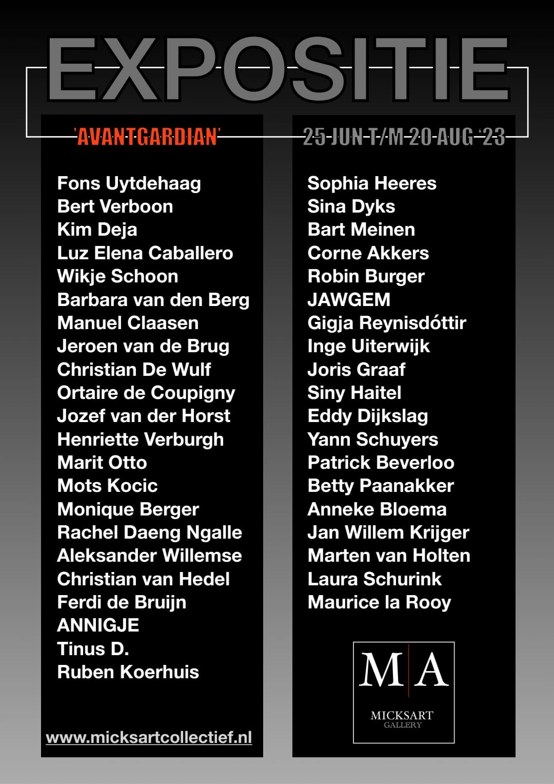
The participants in this group exhibition are:
MY MESSAGE MY 'FEEL GOOD' ART COLLECTION.
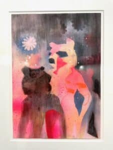
Welcome to the world of happiness. A world of beautiful, a world of happy and cheerful. Feel carefree and positive. Go soft and loving in a harsh society full of frustration, lust, greed, jealousy, seduction and struggle. Love soft, as you are deep down. Welcome to the flower power of the twenties!
ME, ALEK| SANDER. My roots lie in advertising where I worked as a concept maker. My creative work was nominated and awarded. Then I became a photographer. My photo work also won many prizes and was shown to the public in various galleries and museums and at photo festivals around the world. As an artist, I – Alek|sander – am at least as ambitious. My aim is to reach a large audience worldwide with a message of happiness. Making as many people as possible happy with my art; That's my mission.
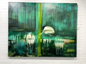
THE POWER OF FLOWER. I've loved flowers all my life. That is why I created an archive that I still supplement daily with new flowers. With these images I now create collages that convey my message of love and happiness. Flowers are able to soften the harsh reality. To 'mask' what is evil. My flowers let you experience the tension between what you see and what you feel.
THE FUTURE OF ‘FEEL GOOD ART’. We live in the middle of the information age. Throughout the day we are kept informed of the events in the world. Whether you like it or not, you can't shut yourself off from it. Attacks in the Middle East, threats in the West, natural disasters in the Orient, life around us is getting darker and darker. The desire grows to dream away and just feel good. And I – Alek|sander – want to give you that with all my feel good (h)art.

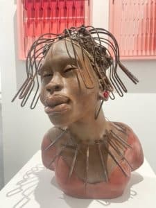
Luz Elena Caballero is a Colombian artist based in the Netherlands whose paintings have been featured nationally in solo and group exhibitions. She mentions the human figure as the most important element in her works. Through this, she explores different aspects of what it means to be human, what makes us different and what unites us. Caballero usually uses oils on linen or metal.

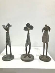
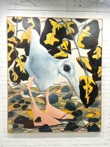
Surreal animal art by visual artist Anneke Bloema
As a kid, I loved drawing and animals and playing outdoors. At home, I was allowed to keep many pets, including a cat, rabbits, guinea pigs, and chickens. I loved to take care of them.
I have an older brother and a younger sister. We’re very close in age. I have fond memories of our imaginative childhood together. We played and fought together as pirates, as princes and princesses, and of course as ourselves.
When I was 18 I took photography as a hobby, soon after enrolling in a course at ‘De Fotovakschool’. Gradually photography became my profession, and in 2001 I founded my own company The Factory II.
I started to do more and more graphic designs like collages. In time I found a way to tell the stories I wanted to tell. After winning an important prize for my illustrations, I was very encouraged to go on. And that’s what I did. Nowadays I spend a lot of time making these collages. Having a very big photo archive of my own allows me to use mostly my own pictures in my storytelling animal artwork.

ANNIGJE (1961) bags is a regular exhibitor at Micksart Collective. It has been more than 10 years since the first bag was created. Somewhere between sleeping and waking up, a clear picture emerged of the bag I was going to make. There are now many ANNIGJE's in use all over the world. The handbags are always unique and are characterized by enthusiastic use of color and stubborn design.
Together with Erik and our team we created the MI&ANN label: Art Jackets.
Together we are creative entrepreneurs and enjoy promoting participating artists.

In his abstract photographic art, self-taught visual artist Joris Graaf (The Hague, 1980) seeks to create tension by forming a synthesis of opposites: melody and noise, rhythm and chaos, darkness and light.
His work is inspired by music and contemporary abstract painting. He is fascinated by the emotive power of colour and shape.
Joris has a background in earth sciences and worked as a geologist for over a decade before shifting his focus to the arts. Recurring stylistic elements in his work are the use of an altered, minimal but intense colour palette and an interplay of order and confusion, of spontaneity and restraint.
Joris’ work is on display in galleries in the Netherlands and Belgium. He was selected for New Dutch Photography Talent 2019 and Fresh Eyes (European photography talent) 2019 by GUP magazine.
He works and resides in Wateringen, the Netherlands.
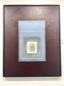
1969, born in Nijmegen. His work can be seen in many countries all over the world. Corné employs a variety of styles that all have one thing in common: the ever search for the light on phenomena and all the shadows and light planes they block in. His favorites in doing so are oil paint, dry pastel and graphite pencil.
He states that it is not the form or the theme that counts but the way planes of certain tonal quality vary and block in the lights. Colours are relatively unimportant and can take on whatever scheme. It is the tonal quality that is ever present in his work, creating the illusion of depth and mass on a flat 2d-plane.
Corné combines figurative work with the search for abstraction because neither in extremo can provide the desired art statement the public expects from an artist. Besides all that, exaggeration and deviation is the standard and results in a typical use of a strong colour scheme and a hugh tonal bandwith, in order to create art that, when the canvas or paper would be torn into pieces, in essence still would be recognizable.

Jochem van Aller (JAWGEM) lives and works from The Hague. He graduated as an illustrator from the Willem de Kooning Academy. His work is characterized by a play of light and dark, or, in his words, the positive and the negative. The style is recognizable by clean clear lines and varies from paintings, illustration, typography, murals, screen prints and objects.
The works alternate between fairly abstract compositions and figurative illustrations with a lot of detail. Sometimes a bit naughty or socially critical. Due to youthful naivety, the work is often perceived as cheerful and colorful at first sight, but there is a deeper message behind it. He draws his inspiration from designs of the 80s, fashion, pop culture, comics and various image memories from his own childhood.

After the war, my father founded the Department of Goldsmiths Academy Maastricht. He was very intensively involved in this, at home was also Academy. Holidays in France, those were searches for a small Etruscan figurine or a Luristan bronze, it was about the Euphrates and the Tigris, Mesopotamia and where is for the first time bronze cast and much more.
I often went to the Academy, it smelled like fire and other exciting things, pitch for example. But I didn't want to be an artist, I wanted to do something normal. Things turned out differently, my mother, the stable factor, became ill and died far too young. I went to the Academy from then on, it was too difficult not the goldsmiths, but the people.
After the Academy I didn't work for a long time, I had children (finally something normal). When the children were out the door, I started working in the Bronze foundry Sijen (a pupil of my father). After years of working for other sculptors, I increasingly felt the need to make something for myself again. And now I'm always amazed that I make what I make. There's something tucked in that keeps coming out now. I've watched and seen a lot.
Education: Academy of Fine Arts Maastricht dept. Goldsmiths 1963-1968
Visual artist Christian van Hedel (1974) mainly paints non-figurative abstract art. He has been active as a visual artist for over 20 years now. Christian started out as a self-taught artist, but after attending various workshops he got more and more into it, for example, he followed the fine-art training at the Hogeschool voor de Kunsten in Utrecht (HKU). His work can be found regularly at various art fairs and exhibitions in the Netherlands, Belgium, Germany, Spain, Denmark, France, Italy, China, New York and everything in between.
Christian has already won several international audience awards for his works of art. His works are sold worldwide. In a museum in China his work is part of a permanent collection of the museum.
In early 2017, Christian started a brand new project which he called “Fiction Elements”. This new series consists of colorful wall-filling paintings. The works are inspired by the natural and essential spiritual energies of everyday life. Conscious of the unconscious, both opaque and transparent spots, lines, shapes and lines are painted on canvas or on wooden panels. The contrasts between dark and light, colors and black and white always predominate. The shapes are very precisely defined, evoked precisely by the paint matter or created by the idiosyncratic use of brushes or palette knives. Because of the black lines Christian uses in his work, it becomes an abstract comic-like representation that balances the whole. His work tends towards street art or urban art. The works of art are visual concentrations of experiences, dreams and reflections. Autobiographical images, in which Christian tries to broaden the field of perception beyond the purely visual. There’s more to it than you see; art as food for the eye and the mind.

Geboren: 18 juli 1938 in Barendrecht, Zuid-Holland, Nederland
Jan van der Voo is een striptekenaar wiens professionele carrière begon met een strip over de bouw van de Rotterdamse metro, ‘De Metroriet’.
In de jaren 60 werkte hij samen met Jan Kruis aan reclamestrips die werden gepubliceerd in “Donald Duck” en andere kinderstrips. Hun klanten waren onder andere Mars, Bounty, Milky Way, De Ruijter en anderen.
Hij werkte samen met Wim Meuldijk aan een stripbewerking van diens televisiekarakter ‘Pipo de Clown’ (1969–1973) en tekende de laatste jaren (1974–1979) van Meuldijks langlopende ‘Ketelbinkie’-film over een jongen met superkrachten, beide in “Donald Duck”.
Hij publiceerde ook regelmatig in “Sjors” in de late jaren 60 en de jaren 70.
In 1982 verhuisde hij naar Nieuw-Zeeland, waar hij tot 1997 bleef. Hij was politiek cartoonist voor de “New Zealand Herald”.
Na zijn terugkeer in Nederland illustreerde hij educatieve boeken en maakte hij de humoristische rubriek ‘Even een Piraatje’ in “MYX Stripmagazine”.

De geboren en getogen Hillegomse kunstenaar is een autodidact pur sang. Van jongs af aan vormt hij zijn eigen visie en oplossingen op ieder vlak en legt zo de basis voor zijn creativiteit. Dit fundament en laat hem buiten de geijkte paden zijn levensweg bewandelen.
Muren zijn de eerste dragers van zijn kunstzinnige uitingen, gevangen in maatschappijkritische graffiti’s.
Zijn werken tonen zijn veelzijdigheid, het gaat van realistische portretten, langs surrealistische werken, naar abstract. Zijn werk is dan ook moeilijk in woorden te vatten. Typerend is dat niets is wat het lijkt en dat in ieder werk een ontdekkingsreis schuilt.
Gezegend met kunst graaft hij in steeds diepere gronden, op zoek naar grenzen van de geest, om zichzelf te ontstijgen. “Ieder nieuw werk is een wedergeboorte na de dood van de vervolmaking van het vorige zijn. Zijn is het grootste goed, beter je leven.”

Dijkslag's work is characterized by his graphic working method.
With characteristic clean lines, well-known and lesser-known landscapes and industrial buildings are elevated to special spherical compositions.
Always difficult to tell anything about yourself, but .... I have been designing and producing various home accessories for more than 25 years, such as clocks and mood lamps in my studio in Dronten. In addition to using various production techniques such as flatbed printing, milling, lasering, hot bending, sawing and 3D printing, I also started in 2003 with a long-cherished wish to paint as well. I use acrylic paint on high-quality synthetics.
My drive as a self-taught artist is that I add an extra dimension to everyday objects. For example, a mood lamp is already a beautiful art object during the day, but in the evening it has a completely different look.
In short: functional art made in Holland with the added bonus that every object is UNIQUE!
If you have specific wishes, please let me know.
Of course you can also visit my studio (by appointment).
So let yourself be surprised!
Laura Schurink is a Rotterdam based composition artist who graduated in fashion design in 2015. After realizing that she did not want to participate in the fashion industry due to its toxic work ethic and environmental pollution, she started to find her inspiration in the objects she found at second-hand shops. Nowadays, Laura specializes in sculptures, installations and collages, through which you can still clearly see her fashion background. Her works are mainly created out of used materials, which makes every piece unique and sustainable.
Laura's compositions are playful experiments to find new aesthetics with the perfect balance between colour, shape, material, and texture. She places second-hand components out of their context to participate in new constructions, which reflect the beauty that she sees in these materials. The history of textures that the materials possess give her works a natural charm and a sense of spontaneity. With her colorful sculptures Laura shows how recycling can be used as a fun design tool, that can spark creativity and playfulness.
As a critical reference to her fashion background, every artwork is named after the season in which the sculpture is created. Fashion designers are expected to make a collection every season, which creates creative and mental pressure on the artists. Laura makes only a couple of artworks every season, and though these references, she wants to emphasize the time needed to create sustainably.
Laura's sculptures are light and playful. If you come close, you might distinguish the appropriated objects that she cleverly uses. She makes use of a distinct colour palette that invites you into her world that you will never want to leave.
Wikje Schoon Berentschot - 1963
Studied autonomous painting at the CABK art academy in Kampen from 1980 to 1984, where she mainly focused on composition, material research, handwriting and collage techniques. But something was still missing. After years of struggling and searching, she noticed De Gericault's Mad portraits in old textbooks. Thus began a new search. The real turning point came when she accidentally discovered stone sculpting. Contrary to the usual practice of working directly in stone (en taille direct or direct carving) no abstract or abstracted work. But she started to work figuratively, almost realistic. This started the shaping of silent witnesses to injustice, vulnerability and fears.
In recent years, in addition to working in stone, she has also devoted herself to other materials such as wax and clay. This results in bronze, acrylic or aluminum sculptures. This opens up completely different possibilities in design.
Gígja Reynisdóttir is an Icelandic artist living in Bergen, North Holland.
She obtained her MFA at the Sandberg Institute in Amsterdam in Video Art and Installations, in the year 2000.
In recent years, she has mainly focused on objects cut from paper or plastic wrap and fine pencil drawings. She recently developed a technique that allows her to dry and preserve plant leaves in order to be able to use them as a material to draw on.
Natural forms from the plant kingdom are an important source of inspiration in the work of Gígja Reynisdóttir, which she then interweaves with the conceptual aspect of her work, i.e. the complexity of human emotions, relationships and social issues.
Trained as a ballet dancer, I made my debut as a painter in 1970 through an exhibition in Vlissingen.
Subsequently and in parallel I made a journey through the landscape of art, fashion, design and culture through various entrances: journalism, study (art) psychology, publications, making postgraduate courses for art academies, teaching, giving lectures and through my own school (Livingstonelab).
To finish where and how I started 30 years earlier, as a full-time painter. Occasionally, by the way, I do allow myself a foray into poetry.

Sculptor, 3D designer, Painter. Born in the Netherlands in 1957
“Originality is the highest form of creativity “
Being creatively inspired at the age of 14, I was surrounded with all the books from the modern artists like Moore to Miro. Combined with the esotheric experience at the age of 16, it resulted in an enormous production of ceramic sculptures up to 200 pcs a year. This high production phase was a major step that gave shape to my form vocabulary for the future. Working and living for many years in Italy, carving with the Italian masters was the next experience to follow my creative destiny. Having lived in 6 countries, like USA and the Caribbean, you will find my work in many private art collections.
Purpose of my Art is to expand consciousness, making the viewer happy
Making Art is an expanding experience as you are living in the "here and now ". Purpose of my forms is creating purity and simplicity in form, creating visual harmony, peace and joy for the eye and soul.
Creating Process and form language
My Art forms are usually organic shapes combined with geometrical forms, as they appear on the way of creating a form. Making hundreds of drawings a week I would take one out to enlarge it as a Wall Art form. The Galactic art series in an architectural Wall Art form are my latest examples.
Happy colors in combination with gold will usually give the spectator a sense of alignment.
The bronzes have usually no specific colors since a highly polished surface will accentuate their form.

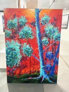
Inge Uiterwijk (1978), Photography
She lives and works in Schoonoord, The Netherlands, where she was born and raised. From an early age, expressions through photography and other art forms have been a part of her life, but she took her first real steps in photography around 2017.
Inge has spent a lot of time outdoors which led to great admiration for the beauty of nature. This emotion is the basis for her work as a photographer, where she focuses on landscapes and nature in which trees, plants and flowers play a leading role. Inge works mainly in her immediate surroundings; a familiar place in constant change and transition where memories and experiences are embedded. There is no specific message or meaning in her current work. There are multiple interpretations which are open to the viewer to explore.
Inge's photography is seen as ethereal and dreamlike but is also capturing moments of absolute stillness and silence without human presence. Bounderies between reality and fiction are not always clear in her work which gives the images an unreal, dark and mysterious feeling.
Inge works with the elements of nature to create a specific atmosphere. Post processing the images is just as important in her work as photographing itself. With the use of sometimes unusual color palettes, effects or combining different images, a new reality is created where mood is key.
After high school, Jeroen was introduced to jewelry design at the Rietveld Academy during the foundation year. Because he also wanted to carry out these designs himself, he then did the jewelry training in Schoonhoven.
Years ago, he and his wife came into contact with glass art in Leerdam. A visit to a glass gallery there made them fall like a stone for a few unique objects by Floris Meydam. Because Jeroen was fascinated by the glass and wanted to work with it himself, he and his wife started looking for the various techniques to get an idea of what is possible and especially what is not possible with the hot glass.
In the meantime, they had found a nice building in Hoorn where they started their glass art GalerieX.
After attending glassblowing workshops in Leerdam and a flat glass art workshop at Van Tetterode in Amsterdam, Jeroen started designing again. This time in blown and then often ground into the final shape.
In the execution of his pieces, Jeroen has looked for the play of light and color, to which the use of thick glass / crystal is particularly suitable. The shapes are usually organic and due to the use of a lot of clear glass rather heavy. He chooses his colours with care and, if possible, names them on the basis of gemstones.
Nowadays he works a lot with the master glassblower Gert Bulée, who was the master of the glass workshop of Royal Leerdam for many years.
1957 Groningen
The paintings reflect my ideas of how to make a painting, based on a canvas, adding and removing oil paint, and often with a restricted form. Some paintings refer to architectural forms. Most of my paintings are abstract; some of them refer to murals and the use of colors are mainly modest.
The canvases have mostly a structure oil paint surface due to the way I paint. They are meant to be color field paintings.

Manuel Claasen (Oostzaan 1939) studied Dutch language and literature, (art) history and theatre studies at the University of Amsterdam.
From 1994 to 1999 he studied drawing, painting and graphics at the Gerrit Rietveld Art Academy in Amsterdam. For a number of years he led the theatre group "De Collectie" in Amsterdam. Until 1998 he taught Dutch at HAVO and VWO.
He lives and works in Gasselte. In addition to his work as a visual artist, he is engaged in writing, making music (various recorders) and giving lectures and/or lectures from time to time.

Sina creates ingenious textile works in the form of colourful, seductive installations. demonstrates versatile material knowledge and innovative technical ingenuity. For example, she knows how to upcycle plastic into beautiful yarn that she then interweaves into her textile sculptures. She combines a traditional way of working with technological know-how. For example, has designed a program for the loom. With steam, she brings out the yarn in specific places; In this way, she transforms the woven surface into a three-dimensional landscape.
Sina challenges the boundaries of the loom, but also those of our perception; Her imposing textile sculptures float in space and tempt us to closer inspection. The urge to innovate and love for the material burst from these stimulating, inviting works.
In his work, Jozef van den Horst combines his curiosity about the possibilities of neon glass with his Italian sources of inspiration.
Jozef uses a lot of formica in his work. He once started making metal plastics, inspired by the Swiss Tinguely, who made bizarre sculpture machines. At that time, Jozef also made silver jewelry and worked with gas burners to solder silver. From his skill of working with fire and burners arose the link to neon sculptures, for which you first make neon tubes warm and soft in a flame and then bend them. The neon glass blowing ensures that the tube stays round and does not fold in half or become flat.
Jozef: "By fusing different colors of glass together, different combinations are created that I use in my 3Dneon sculptures."

Bert Verboon, born in 1948, has been intensively involved in sculpting since 2001 and from August 2012 he has been working on it almost full-time, after having retired as a lecturer in Research and Design. Initially, Bert was a traditional sculptor. Many sculptures were carved from various types of stone and usually completely polished to show off the color and structure of the stone. He also made a series of geometric sculptures, which seem to have been put together in one way or another, but they are each cut entirely from a whole block of limestone.
Then he worked with the combination of marble and stainless steel. This resulted in the series of "Frames", in which a processed piece of marble was fixed in a stainless steel frame.
Nowadays he often makes specific objects from industrial material, stainless steel, that have a minimalist look. But simplicity of space does not necessarily come down to simplicity of experience. His constructions make complex encounters possible for spectators, as the reflections on the reflective material move as one walks along the works. These objects can also be manufactured in a larger size and are highly resistant to weather influences.
His sculptures are often a mix of realism and abstraction. A work doesn't necessarily have to have a lot of things to look at, compare, ponder, and analyze. The work as a whole, its quality as a whole, is the interesting thing. Shape, image and color are usually singular.

Mijn beelden zijn gemaakt van staal, dat las of smeed ik, en werk het verder af met koperslag en roet. Het groene patina ontstaat door een bewerking met verschillende zuren.
Mijn inspiratie haal ik uit het landschap van bijvoorbeeld IJsland, Slowakije en Polen. Vervallen gebouwen, eenzame huizen, hutjes en bomen.
Ik ben op zoek naar monumentaliteit, kleine werken worden groot, nemen een ruimte in. Het harde lijnenspel en de duidelijke vorm van het staal werken daaraan mee.

Leon Strous kan zichzelf vanaf zijn jeugd niet anders herinneren dan dat hij bezig was met tekenen. Geleidelijk ontwikkelde hij zich daarna verder en kreeg opdrachten. Het illustreren van tijdschriften en enkele boeken, het ontwerpen van logo's en het samenstellen van collages vormden lange tijd een belangrijk stuk werk dat hem veel plezier bezorgde. Later ging hij ook schilderen met olieverf op doek. Zijn schilderijen werden meermalen op exposities getoond.
Ongeveer 25 jaar geleden voelde hij de drang om driedimensionaal te gaan werken. Hij volgde een keramiekopleiding in Amsterdam en sindsdien heeft het werken met klei hem niet meer losgelaten. Leon werkt het liefst met fijne chamotte klei om daarmee zijn werken zo gedetailleerd mogelijk vorm te kunnen geven. Voor het totaalbeeld raadpleegt hij regelmatig zijn vooraf uitgewerkte schetsen.
Zijn werken stralen emotie en balanceren tussen realiteit en abstractie met vooral veel humor en dramatiek. Leon exposeert in binnen- en buitenland. Zijn keramische sculpturen vinden hun weg over de hele wereld. Sinds 2013 is hij lid van de commissie voor keramische kunst van de World Art Games, gezeteld in Kroatië. In 2018 nam hij deel aan het Internationaal Cucuteni Art Camp in Moldavië. In datzelfde jaar werd hij uitgenodigd door Ting Ju Shao (Taiwan) om te participeren in het boek met de titel: 'Molding the World, Ceramic Figures of International Ceramists'.
Ik ben opgegroeid in een klein stadje in het zuiden van Frankrijk, waar het landschap, de rivieren en de kleuren altijd mijn aandacht hadden. Hier begon mijn liefde voor kunst en mijn eigen creatieve ontwikkeling.
Eind jaren '80 heb ik op de kunstacademie geleerd om de tijd te nemen en modellen, schaduwen en lijnen te observeren, om zelf de vormen in schilderijen te kunnen laten spreken.
Mijn liefde voor kunst en mijn gevoelens en passie voor kleuren, lijnen en contrasten maken mijn schilderijen mysterieus en spannend.
De gouden 'touch' en de effecten van het licht op een donkere achtergrond doen denken aan de Clair Obscur techniek, die veel in de schilderkunst van de 17e eeuw werd gebruikt.
Mijn uitdaging is om de kijker uit te dagen en mijn werk in hun beleving te laten spreken. Mijn schilderijen geven geen antwoorden maar roepen juist vragen op.
Mijn werk is steeds verschillend in uitvoering. Personages met een verhaal, een harmonie van kleuren, strakheid, puurheid en romance.

Hunting my shadow whose freedom got out of hand when its many legged fancies took an independent stand.

My passion for making glass art started after I retired as virologist from a senior position in a global vaccine company and suddenly had ‘a sea of time’ to explore new horizons. The choice for glass art was made almost by default. When I stumbled across an introductory course in glass making, I thought I’d give it a try. And I was hooked right away. Glass is a wonderful medium—fluid and solid, flexible and fixed. In its molten state it’s a dancing, dangerous, almost sensual thing. It’s possible to direct this dance towards the fixed form, if you are skilled and experienced enough. For a beginner like me, there’s so much to learn. That’s part of the fascination.
For making my objects – with the assistance of master glass blower and artist Gert Bullée – I draw inspiration from the things that interests and excites me: nature, science, travel, humanity.
But my passion for glass is as much about exploring new technical skills as new ideas. In my recent artworks I use metals like brass, copper and metal mesh and all kind of metal oxides in the hope to create fascinating structures and color patterns. I hope that by showing other people my artworks, I might inspire them to think, or create, or contact me for a chat. It’s an invitation for dialogue.

"I can experience art on many levels and ways. Then I look at aesthetics and expressiveness, but also at a special angle. I make contemporary engaged art. It has a certain urgency. It mirrors us, humans and the zeitgeist. Images say more than words and actually appeal very directly to our feelings. My images are a kind of mix of activism and philosophy, they want to engage in dialogue."
I was born in Hoorn (NH) (1970) and have been working as a visual artist since 1994. I am a multidisciplinary artist. My autonomous work areas are divided into painting, collage, installation, digital art, photo manipulation, video art and 3d. I also work on assignment and on a project basis.
Characteristic of my autonomous work is the central role for humans in form and behavior. My work is a reflection of current themes, but the everyday and the personal are also important sources of inspiration. I play with and cross reality. Through small interventions, repetitions, reversals, or breaking through planes with architectural forms, a new image is created in a somewhat familiar image.
Although my work is aesthetic to look at, there is often a kind of unease in it. Abrasive aesthetics. This duality or doubleness is also a recurring fact. Do you see what you see?
The resulting images often straddle the intersection of fiction, realism, graphic and plastic.
Born in 1958 in Amsterdam.
Marten lives in Winschoten between the polders of the Northern Netherlands.
After several years of working on music and conceptual projects, Marten started painting. His inspiration is the enormous vastness of the north and the mudflats. His work shows the silence that you can experience when you are "in the middle of nowhere".
When you stand in "nothingness", with the horizon on all sides, you only feel connected to nature, to the place where you are.
The silence is not limited to your ears.
In addition to painting, Marten is a filmmaker of documentary and feature films. In his films he also shows the peace that you can experience when everything goes slower, which is quieter.
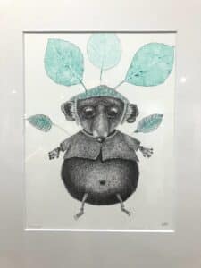
After the Graphic School and 1 year Rietveld Academy I started painting with oil paint and followed several courses in lithography (stone printing). I switched to drawing and mono prints because I get along better with this material. Since 2005 I also make drypoint etchings.
My work is illustrative and animals (with human traits) play an important role in this.
Fantasy and humor are important to me and with every work I give the viewer the opportunity to come up with his own story.
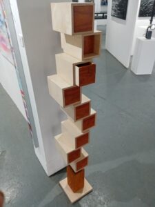
Mots Kocic, born and raised in Yugoslavia, now Croatia....Worked with great passion as a furniture maker, as most furniture makers are... Now free to spend his free time on what he really likes: creating utensils made of wood with a special design... His works are characterized by the idea that such a thing has never been made or seen before...
He has exhibited at various exhibitions in Steenwijkerland ("If you like wood", "Zevensprong", etc). One of his colourful chests of drawers has been donated to the Isala hospital, children's ward.....
In 2019 he participated in the "Summer Expo 2019"..... This is the country's largest art sales exhibition.... The exhibition attracted 78,000 visitors, there were many enthusiastic reactions and a quarter of the works were sold. Mots' chest of drawers has been at the Fundatie Zwolle for 3 months... and received many rave reviews....
Continue as long as possible to be able to make beautiful things, in complete freedom, is his motto!
Robin Burger, a painter, photographer, musician and visual artist! Robin Burger is continually triggered by elements in his everyday surroundings. Robin burger sees, where others would turn a blind eye, like gum marks in streets or the patterns in a scaffolding. The result is a devoted yet critical view of our reality culminating in powerful images. Central to his work are certain distinctive themes such as society and nature, humour, western iconic images, and often have a dreamy fantastical quality. He questions the monotony of our everyday, challenges it, criticizes it, and is also amazed by it. He uses these inspiring elements and combines them into original works of art; a fusion which is typical of Robin Burger.
The French artist Ortaire de Coupigny nowadays gets most sardine cans directly from a cannery. So that he does not have to empty all the cans himself before turning them into a work of art and almost turning him into a 'fish' himself.
The fish are made of wax and painted with different materials. For example, the black of the fish is used carbon pigments.
When the fish are ready, they go in the can on a layer of wax. Two types of resin are then poured on it. The first is an epoxy that ensures that the wax is not damaged and the second layer a polyester that gives a smooth result. The tab to open the cans serves as a hanging system at the back.

De weg van Kristin liep langs vele experimenten. Deze experimenten vertaalden zich in vorm, techniek en inhoud: loskomen van de draaitafel, experimenteren met alternatieve opbouw, andere materialen,nieuwe proeven, het bouwen van een eigen oven….
De afgelegde weg staat eerlijk met de pootjes in het leven. Er is bij wijlen hard gewerkt om de kop boven water te houden maar nooit verried de kunstenares haar werk.
De tijd gespendeerd in de lokalen van Sint-Lucas, tijdens of na de uren, de enthousiaste stappen in de sferen van het betere amateurtoneel, het plezier om deel te nemen aan rollenspelen, het leiden van een koor…. staan allemaal voor vrijheid en goesting in het experiment. Het lesgeven dat er al snel op volgde kreeg steeds meer het accent op ‘geven’: een open kijk meegeven, het plezier te zien, te voelen. Graag zien en graag voelen.
Maar ook uiteindelijk, schuilgaand achter de ogenschijnlijke constante der verandering, een gedreven, haast mystieke queeste naar zielenrust. Kristin’s werk is niet alleen eerlijk in de vorm. Ook inhoudelijk klopt het plaatje. Consequent is wat je ziet de meest buitenste schil van de binnenkant. Navenant de maakster is het werk: zonder kapsones.

Ik ben een illustrator en kunstenaar en werk voornamelijk met pen en inkt, maar doe ook olieverf.
Ik vertel parabels; verhalen in symbolen en tekens. Dat heb ik mijn hele leven gedaan en dat zal ik blijven doen.
De belangrijkste onderwerpen zijn symbolische fantasy, Steampunk en dieren.
Steampunk is een fictiestijl die te maken heeft met een semi-fictieve wereld waarin oude machines uit de Victoriaanse 19e eeuw nog steeds worden gebruikt. Technologieën die nieuw of belangrijk waren voor de Victorianen, zoals stoomkracht, uurwerk of elektriciteit, zijn grote thema's in steampunk.

Born in Amsterdam, moving to Calgary, Canada in my early teens, where I was welcomed by the overwhelming nature. The breathtaking Rocky Mountains, and lakes as big as oceans! A few years later while living in Vancouver, British Columbia these feelings of awe and reverence became further intensified and focused living and breathing as I did among the incredible abundance of nature all around. In particular, the sheer energy and strength of color and form in their ever-changing combinations, became a focal point.
Years later I returned back to the Netherlands and brought back these powerful and intense emotions locked up inside of me.
After having met Willem van Oijen from Bevo glass studio, a period of drawing and painting ensued, liberating and interpreting all these so treasured stored images and thoughts.
Working with a kiln one day " fired" the interest in fusing colored glass. This technique enabled me to express into form, the impressions and expressions of the sensation of fusing colors and shapes in various combinations, as it happens naturally in nature all the time.
But for several years now I am drawn to making sculptures in cire perdue. Making a clay or wax model, the various molds that have to be made before the actual firing and preparing of the kiln. The suspense, the waiting period before the piece can be taking out of the kiln, the 3 dimentionality of the pieces, the directness, strength and radiance are both spectacular as exciting for me.
The aspect of applying color has not changed. What has changed though is the subject and the background thought that I depicted herein are on a different plane. The changing and hardening society and the indifference which one presents itself is striking.
In my works I try to create a setting with a “twist” in which I portray situations confronting the beholder with these issues.

Christian is originally a graphic designer and further trained as a psychotherapist. His studio is also the place where he practices his therapy, a cross-pollination that is the key to his work. His canvases are the expression of his study of the human psyche and a way for the viewer to explore his own frames of reference and emotions.
Christian's style is sculptural in nature, giving both dimension and color to explore important themes about what it means to be a person in society. The works try to reflect what happens when the will of the individual and the normative aspects of the group meet. Shaping this fine line is the challenge he faces, defining this boundary in its many contexts. Each work is a lyrical expression of the artist's own experiences with a tension that we all have to deal with. In our observation we are reminded of our own experiences of this wonderful tension.
Material as a metaphor.
The unusual materials he uses, such as polyurethane and epoxy or fabric, go their own way, you could say that they have a will of their own. The material determines the content. All he does is guide the (processed) material to the desired shape. In this sense, each canvas is unique, just as everyone has a unique life. We can only shape our lives, the content is given to us.

Ruben Koerhuis (1959) has always been concerned with images. First as a maker of (commission) videos and photographer, in which he was used to filling in a fixed frame. The 'why' of that image, as a conscious part of a larger whole, was always central to this. This is reflected in the current work: abstract images with a personal story. No work is a coincidence and it is never just form. With a successful image, there is a balance between the narrative, the emotion, the craft, the continuity and growth within a theme and the lasting wonder through discovery and invention. Recurring elements, such as lead, copper and slate, or the sphere and the circle, are used as a theme and storyteller and give shape to basic desires or (primary) feelings. As if it were the stillness of moments from the maker's life. Work with a purpose. Still, they have generic titles. This is so as not to push the viewer in a particular viewing direction. For the creator it is finished, for the new viewer it starts with the first look, where the origin does not matter. Although it is also no secret: if asked, one will of course receive an explanation.

For me, painting is how life presents itself, how I walk past things and what comes my way.
The positive in life is very important to me. Yet sometimes you can't escape the fact that less fun things come your way. This is invariably followed by a translation on a canvas.
Being positive in life, I get a lot of energy from that.
The rural area in which I live provides a lot of inspiration. Here I can really enjoy the silence. A powerful piece of music also fits in at certain moments.
I feel like a super rich person, that I can be busy with that!

After a process of experimenting with different styles and techniques, Sophia has developed her own style. Her paintings are characterized by powerful compositions, in which each surface gets its own color and these are demarcated with lines at the last moment. Through the use of lines, the work is abstracted, as it were. In some works, the lines become lighter in color to give the work more depth. Light and dark are omitted to stay with the simplicity of the theme.
The themes in her works are nowadays depicted almost realistically. In her current work, colors are increasingly mixed. During the painting process, Sophia seeks a balance in her compositions, background and use of color. Colors are brought together by emotion. Through her color palette, she creates her own reality in which recognition remains.
She finds inspiration in life. It starts with watching. Looking is different from seeing. Inspiration can be a snapshot, a hunch, seeing highly simplified forms of a city or in nature, a shimmer of water or, for example, a beautiful color. Inspiration can be found around you. The difference between looking and seeing gives the process movement and leads to the formation of ideas and images in her own colorful language.
I am Barbara van den Berg a visual artist with a studio in Amsterdam (born in 1978, the Netherlands). I make figurative (digital) collages, mixed media artworks and paintings. In Den Bosch I studied Visual Communication and in 2003 I graduated from the School for Art and Design, St. Joost. I worked as a graphic designer and illustrator for 7 years and then I focused entirely on art.
At a young age I was already fascinated by the behavior of people. As a child I lived in an almost perpetual state of observation, constantly looking around me: how do we relate to each other, how do people show their feelings? How do we make contact with each other? My art is about making contact. I wanted to understand and express what I saw and felt, I mainly did this by drawing and painting at a very young age.
Later I expressed this in making art of people grouped together looking for contact. Everyone screams for attention, but nobody really sees the other. You feel friction between what we show on the outside and what we feel on the inside. I play with this paradox, with bright, vivid colors that leave the appearance of happiness and celebration.
When I had two daughters, I was inspired by their inexhaustible imagination and curiosity about the world. They are so real, genuine, open and playful. They still have a vulnerability and naivety that I admire. Children can keep looking at you without looking away. They make contact without words. That way of making contact fascinates me.
This is how my digital collages came to life, in which I show children in bright colors with an ‘open mind’. Their faces with large eyes and slightly chubby cheeks accentuate childish innocence. They look like a child somewhere between a human and a doll. These children symbolize innocence, playfulness and vulnerability. They look at the world with natural curiosity.

Patrick Beverloo is a versatile artist who knows how to make the unconscious tangible with his work and thus touch people deep into their souls.
Early in his life, Patrick had a keen eye for the beauty of the world around him. As a little boy he spent many hours drawing, claying and woodcarving. He was always looking for new ways to express his imagination. Through his desire to experiment as a child and an innate passion for design, Patrick Beverloo developed naturally in different art styles. With primitive tools such as a bread knife, fork and spoon, Beverloo laid the foundation of his later craftsmanship. He got clay from the meadows of his great-grandmother in the village of Spijk aan de Rijn. With a simple chisel and a Stanley knife, Patrick managed to conjure up impressive sculptures.
Patrick Beverloo's heart lies mainly in the creation of his own works of art. During the creative maturation process, his typical style, with flat, flowing, clean forms, evolved from more realistic work to Art Deco.
Beverloo was introduced to the concept of "mixed media", which comes in handy in the production of his works. Such as versions in Corten steel, bronze casting, Styrofoam, PUR foam, and finishes in hand-lay up glass fiber reinforced polyester. Patrick Beverloo is also a pioneer in traditional digital 3D design. Due to his passion for three-dimensional designs, he has developed further in recent years in 3D scanning with a handheld scanner. He also often designs and makes the tools, moulds and scaffolding to complete an innovative project himself.

is self-taught and from his first exhibition called Trash & Treasure in 1997 he has continuously worked on his own style. He is very involved in nature and the environment and therein lies the reason that he started to make his art from things and material that has been thrown away or discarded and still does so to this day.
In addition to creating sculptures and installations, he also designs various fashion accessories such as spectacular crowns, sunglasses from meccano and various designer handbags with LED lighting. He has won awards at the Cannes Film Festival in 2010, 2011 and 2012.
The feminine forms are also reflected in his work in all kinds of ways, for example the well-known zippers women in different colors and poses and the metal bodies.
In addition, the angel wings are an important part of his work. They are made of metal, synthetics, glass and light. Tinus always finds a new way to achieve a perfect whole with different techniques.

‘What really went on there? We only have this excerpt’
Mijn werk is figuratief. Ik noem het bewust niet realistisch aangezien de werken uit mijn verbeelding ontstaan. Wel kunnen er referenties zijn naar de waarneembare wereld om ons heen. Het perfect realistisch weergeven ervan is echter niet mijn doel.
Ik creëer niet bestaande werelden en ik vermijd al te duidelijke visuele referenties naar bekende verhalen. Het werk ontstaan vanuit min of meer onbewuste beelden. Regelmatig duiken wonderlijke rituelen en figuren op in het werk.
Ook voeg ik vaak diverse elementen samen die in de ons bekende wereld geen betekenis hebben maar wel de geheimzinnige basis kunnen zijn voor gedachten en nieuwe verhalen.

Tijdens de Keramiek Opleiding in Gouda is haar fascinatie voor het draaien ontstaan en heeft haar niet meer losgelaten. Zij maakt haar werk op de draaischijf waarbij zij, afhankelijk van het object, soms meerdere vormen aan elkaar monteert.
Haar kenmerkende decoratie ontstaat vanuit een intuïtieve lijnvoering, geometrisch en abstract, waarbij de kleuren medebepalend zijn voor het beeld. Haar inspiratie komt o.a. uit de Art Deco.
Zij is 7e geworden van de Nationale Keramiekprijs 2023.

Ik heb kunst en kunstgeschiedenis gestudeerd op verschillende academies om docent te worden in de kunsten.
Ik werk als vrij kunstenaar en illustrator.
Ik doe al jaren mee aan cartoonfestivals en heb nationale en internationale prijzen gewonnen. Ook heb ik in verschillende landen deelgenomen aan tentoonstellingen.
Mijn werk varieert van monumentale glasgevels in gebouwen (zoals kerken, stadhuizen, scholen etc.) tot vrijstaande panelen of objecten en sculpturen.
Een belangrijk aspect is dat ik probeer een interactie te creëren tussen tegenstellingen in de manier waarop het oppervlak van een object wordt bewerkt, het gebruik van kleur, het verschil in straling van de gebruikte materialen, het concept en ontwerp.
Door gebruik te maken van contrasten ontstaat er spanning in mijn werk, een spanning die zorgvuldig in evenwicht is, wat resulteert in homogene maar sterke kunstobjecten.
De vaas- of vatvorm in de objecten wordt puur gebruikt als een oppervlak, een basis om op te werken. De vorm of gedaante is slechts secundair aan het nut van het oppervlak en de dikte van het glas, waarbij door middel van verschillende technieken een ontwerp van vloeiende vormen en lijnen kan worden gecreëerd. Het oppervlak van de geblazen glasvorm wordt opnieuw gevormd, gepenetreerd en gemanipuleerd door het gebruik van diep reliëf zandstralen/snijden, snijden, slijpen, polijsten, etsen en graveren. Uiteindelijk wordt de vorm van de vaas of het vat opnieuw gevormd tot een object dat is "geconstrueerd" uit verweven vormen en vormen in een veranderend patroon van gematteerde en transparante delen.

Een vreemde kunstenaar in een vreemd land
Kirsty Fletcher, een Zuid-Afrikaanse kunstenaar die nu in Nederland woont, werkt met wegwerp- en afvalproducten. Haar huidige werk bestaat uit reclamemateriaal dat wekelijks bij de meeste Nederlandse huishoudens wordt bezorgd. Door iets zo gewoons te gebruiken, worden problemen zoals overvloed en overmatige consumptie, die endemisch zijn voor de eerste wereld, onderzocht.
Geïnspireerd door kunstenaars als El Anatsui en Moffat Takadiwa, houdt Kirsty's gebruik van materiaal de boodschap vast die het werk overbrengt. Het arbeidsintensieve proces verwijst naar de verborgen energie- en arbeidskosten waarvan we ons niet bewust zijn. De felle, vrolijke kleuren die worden gebruikt, zijn een metafoor voor beloften die worden gedaan door reclame- en marketingcampagnes.

Yann Schuyers (Oss, 1954) discovered the artist in himself early in his life. As a child he provided hand-drawn illustrations for the school newspaper. Because of his creative mind, Yann soon became interested in photography, and he made shapes in aerated concrete and even cow bones.
"Shapes and colours have challenged me from an early age. For as long as I can remember, I feel the need to make something beautiful, I want to tell stories. Not with words, but with images. I want other people to enjoy my imagination. That's always been my drive. And still do." – Yann Schuyers
Over the years, Yann has immersed himself in a multitude of creative working methods that give him the opportunity to work with form and imagination. Full of interest and enthusiasm, he has been involved in photography, screen printing, drawing and painting with pencil and acrylic paint, digital art and designing gardens and furniture. Yann was also happy to pass on his expertise and enthusiasm to students of the Vrije Academie.
As an image artist, Yann enjoys constantly trying out and applying new techniques and materials. And just like his tastes and interests, his work continues to evolve. He is still fascinated by the work of great predecessors such as Leonardo da Vinci and Rembrandt van Rijn. At the same time, he is triggered by contemporaries and draws inspiration from architecture, design and fashion. But transcending everything is the inspiring inspiration he draws from the beauty of the woman and the female body.
© 2022 MicksArt Collectief. Powered by We’R Media